 info [ AT ] redcardinal [ DOT ] ie


VHI.ie – 5 Simple Steps to Improve UX 100%
I’m fascinated by human psychology, and in particular online human psychology. What makes a user complete one action while ignoring another. How changing some text can double the number of desired actions, or changing the layout of your page can increase your profits exponentially. And so I’m also fascinated by User Experience (“UX”) and trying to apply online behavioural study from the user perspective.
So this post will (almost) totally ignore SEO, and focus purely on some small changes I would make to the website of the Vhi, Ireland’s dominant private health insurance company, in order to improve UX by 100%.
Vhi – Voluntary Health Insurance (vhi.ie)
As a long-time Vhi customer I’m always delighted with the friendly customer-centric approach of their staff. Whenever I call their landlines the vibe and response of their call centre staff is quite inspirational. Seriously – I’ve never had a bad experience calling these guys.
But does that translate to a great online experience?
Replicating the Offline Experience to your Online Channel
Unfortunately for me the simple answer is no – I always find the UX on their website far less compelling. So I’ve put together 5 simple actions I would take to improve the online experience. My top tip is so simple, but incredibly the issue it fixes is quite likely losing Vhi sales. I’ll go in reverse order, keeping the best till last:
If it’s a button don’t tell me to ‘click here’…
I did say ‘if’. This is a pet hate of mine, but I think many people would agree. If you have to tell me to ‘click here’ so I know an element is a button then the element isn’t doing its job:

Click here.. oh it’s a button?
4. I’d love to talk…
These days there is real global push on business efficiency. And many companies are directing support and customer service to more effective communication channels. Judging by the Vhi site they must feel that email is more efficient than the phone line. How can I tell this? The phone number is buried 2 clicks from the homepage. Here’s what you see when you click the ‘Contact’ utility link in the header:

VHI Contact Page
Firstly – no phone number. Instead a form. Something that’s been borne out again and again through testing – users are put off by longer forms. I have a question about my policy and I’d like an answer now. Filling a (long) form doesn’t give me confidence that I’ll receive a timely and accurate answer. In fact, in my particular case I came to the site to find their phone number (as I’m sure many others do also). But I cant easily see any phone contacts. I’m certainly not being pushed into a phone session am I? (One thing I do like about this form is the ability to find my policy number – maybe I’m the exception to the rule, but my policy number is something I never have to hand.)
Without wanting to give away my next tip, there are in fact some further links to phone contacts. There not exactly screaming out however. Let me suggest a small change:

Using underline style helps links stand out
And again with some further styling changes:

Using conventional blue underlined links
And that leads me nicely to my next gripetip ![]()
3. Stick with convention – let the links be themselves
Over the past few years I’ve grown more and more convinced that convention is a good thing. When I land on a web page it’s great to easily and quickly identify either what I’m looking for, or how to get there. In the case of the latter using conventionally styled hyperlinks can be a real plus.
Here’s a page from Vhi’s Mutlitrip Insurance section:
Vhi Multitrip Insurance Homepage
And here’s another page one click deeper, the ‘How to Contact/Claim’ page:
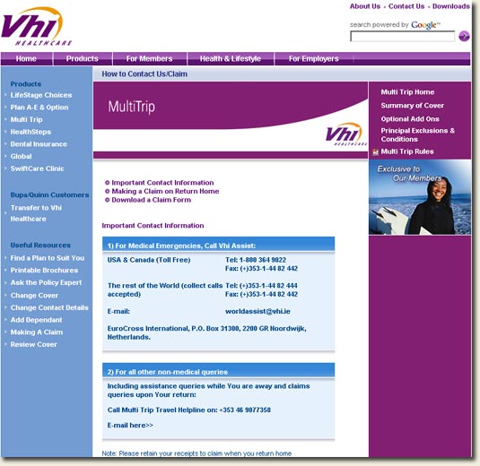
Vhi Mutlitrip Insurance Contact and Claim Page
So can you tell where the hyperlinks are? OK – I did shrink the page to fit my blog, but even at that size you’d easily be able to see a blue underlined link. Here’s the last page, but this time using conventional styling on the links:

Example using conventional hyperlink styling
Did you notice that both original images used bulleted lists? But did you realise that one of those lists was actually live links while the other was not? That, in my opinion, confuses users. And confusion, or to be more correct, avoiding confusion, is one of the primary reasons I’m a convert when it comes to convention styling on links.
I know that occasionally blue links wont fit with the theme of your site, but I don’t think you should ever use purple non-underlined text hyperlinks. This is doubly confusing because, by convention, purple is the colour conventionally used to signify a visited link. It appears however that the styling used on Vhi.ie is purple non-underlined for links the user has already visited (did you notice that on the ‘Phone’ link in Point 4. above?). Not ideal in my view, and trivial to fix even for a large site like Vhi.ie (the joys of CSS!).
So there’s Tip #3 – within body content use conventional blue underlined text for hyperlinks, purple for visited links.
2. Show me where I am
Here’s the Vhi’s Multitrip Insurance page:

Multitrip Insurance Page – where I am within the site?
But if you landed on that page would you have any idea where you were on the site? Can you see any indication of your location within the hierarchy? There are some relatively simple ways to do this:
- Use a current class on primary and secondary navigation – active class styling on the Products link in the main navigation, and similarly, on the ‘Multi Trip’ link in the secondary navigation.
- Use a Breadcrumb to indicate current location – simple but effective tool that helps ‘ground’ users, and assist with internal navigation (and search engine optimisation)
Here’s what a breadcrumb device might look like on that page:

Use a breadcrumb to indicate current location
So my pen-ultimate tip – give adequate indication of current location. It helps ground the user, and facilitates vertical navigation.
1. Where are you vhi.ie?
Here’s the biggest flaw, and also the easiest to fix. It still stuns me when I find this flaw, even more so for a large corporate site which is a profit-center in its own right. I’ve written about this issue previously for nch.ie, and here it is again. (And just in case you don’t think this is widespread – for months http://iedr.ie showed the same behaviour. This has since been fixed though.)

Requesting http://vhi.ie (non-www) resolves to a blank page
Here’s the link – try it for yourself
Now generally I would advise serving content on either www or non-www, but not both. If you do serve on both then you should ensure that each is the same.
This case however is the worst possible schenario – consider the number of Internet users who do not know the technical difference between www and non-www. Many less-savvy web users will not know to re-try www.vhi.ie when they see that blank page, and it should be a simple configuration change to ensure that both URLs resolve properly.
Given that www.vhi.ie is a transactional site fixing this issue will increase sales for Vhi.ie. Absolutely no doubt in my mind.
So there’s my #1 tip – don’t serve a blank page on http://vhi.ie
So there you have it – how in 5 quite simple steps I think Vhi.ie could improve their UX (and perhaps their SEO also) by 100%.
[Postscript: I first started writing this post in December 2007. It has sat in my drafts since then collecting dust. Luckily (for me anyhow) the VHI have not changed any of the behaviour I discuss above. I hope that might change shortly however.]

Nice analysis of VHI’s site. The non-www problem is something that has always puzzled me also.
A good example I have seen recently is the Companies House site which must be one of the most-visited sites in the UK. However, http://companieshouse.gov.uk/ returns a 404
changing the htaccess to redirect to (what google calls) the canonical version of the domain is a 30 sec job. Makes you wonder sometimes!
Comment by Neil D — July 23, 2008 @ 12:27 am
Hi Richard
As usual some great tips on how people can improve their websites. The only thing I don’t agree with you on is the “Click here” point.
From my experience, I always found that “telling” your visitors what to do will get better results in terms of click throughs and conversions.
You should look at Brian Clark’s simple experiment – http://www.copyblogger.com/click-here/ – the results are very convincing.
This does of course go against what the WAI accessibility guidelines, which is another days work – but none the less, I wouldn’t get VHI to change this, it’s probably the most clicked buttons on the site based on your other findings!
Comment by Tom Doyle — July 23, 2008 @ 10:56 am
Hey Tom
Good to e-see you.
I’m not actually against ‘click here’, just not happy when buttons look so little like buttons that ‘click here’ is required. I honestly think that designers should be able to come up with better mechanisms. Personal bias I suppose.
Rgds, and thanks for dropping by
Richard
Comment by Richard Hearne — July 23, 2008 @ 12:54 pm
I second your recommendation in staying with conventions, especially for hyperlinks. There are too many ways to make fancy links but only a few usable ones.
Comment by Ad Manager — July 24, 2008 @ 4:25 am
@Neil D – your comment got filtered out by Askimet. Sorry about that. Thanks for commenting.
Rgds
Richard
Comment by Richard Hearne — July 24, 2008 @ 8:20 am
@Richard – a very informative analysis on search engine optimisation you have there. btw, does the www and non-www only controllable through htaccess or through your domain name host?
Comment by Chad — September 5, 2008 @ 9:10 pm
@Chad – it depends on the domain host I’d imagine. GoDaddy let you do some stuff like this.
It also depends on your server OS. MS servers have a different way of handling this.
You can also do the redirects at the script level. It incurs a little more overhead, and I’d always try to get the server to do this, but if all else fails use scripts.
Rgds, and thanks for commenting
Richard
Comment by admin — September 7, 2008 @ 4:45 pm
Totally on the money Richard, with maybe the exception of click here, for some internet novices and im sure with the age profile of a large portion vhi clients it cant do any harm to make the action as obvious as possible. You had time to play around with google chrome yet,
Derek
Comment by Derek — September 15, 2008 @ 1:59 am
[...] Experience and testing. As always Richard provides brilliant advice which you can read in his post providing 5 simple user experience steps for VHI.ie I have to admit that I’ve learned a lot from that [...]
Pingback by Better Late Than Never Links | Ireland SEO Marketing Online — September 16, 2008 @ 6:26 pm
Hi Derek
I’m not convinced that ‘click here’ is the most effective way to inform users about navigational elements. I just cant help thinking effective UI design would remove the need for ‘click here’. But hey, that’s just my opinion
Thanks for dropping by, rgds
Richard
Comment by webmaster — September 18, 2008 @ 4:03 pm
Its amazing how the internet standard has changed with website development when i look back at what would of been considered a major website and how it would relate to today’s standard when even the standard cms style websites are of a much more fluid and artful design. Wonder if it will keep progressing the same way in another 6 years that we look back and laugh at websites now!
Comment by shane — April 19, 2014 @ 12:15 am
I recently had a claim from V.H.I and they asked me to complete a survey to get feedback but having been asked to go to my claim.vhi.ie I could not find anything about a survey on any site. What a waste of my time and I trying to comply! Hope you have better luck if you try to find a survey.
Comment by ||||||||||||||||||||||||Tom Allen — August 1, 2014 @ 2:26 pm